Scenic Design
Perspective
As a scenic designer I love to work on shows that have great nuance within their scripts, which often, with the vision of the director, lead to a re-imagined landscape. In some cases magical realism helps articulate complexities in the script, while others benefit from broad simple elegant forms- just as in a 5 second figure drawing, I try to capture the essence of the story's time and place that would most accent it's narrative and create opportunity for spatial dynamism.
Background
My love for theater began, like most, on stage, singing/dancing in the chorus. I quickly found my way backstage as a painter and began designing in college with a huge musical Aida. I then completed a scenic design intensive with Bay Area designer Erik Flatmo, and under his mentorship designed an alternative take on Into the Woods. I advised on scenic design for small budget shows and worked on my first play in Seneca's Oedipus. In the final year of my BA I designed The Last Five Years and Stanford Class of 2012's Senior Formal. In addition to designing, I also assisted in the Studio of Erik Flatmo and Daniel Ostling, held a fellowship at American Conservatory Theater, and interned in scenic painting at the renowned Williamstown Theater Festival.
‘ Will you share your life with me for the next ten lifetimes,
for a million summers till the world explodes,
till there's no one left who has ever known us apart?’
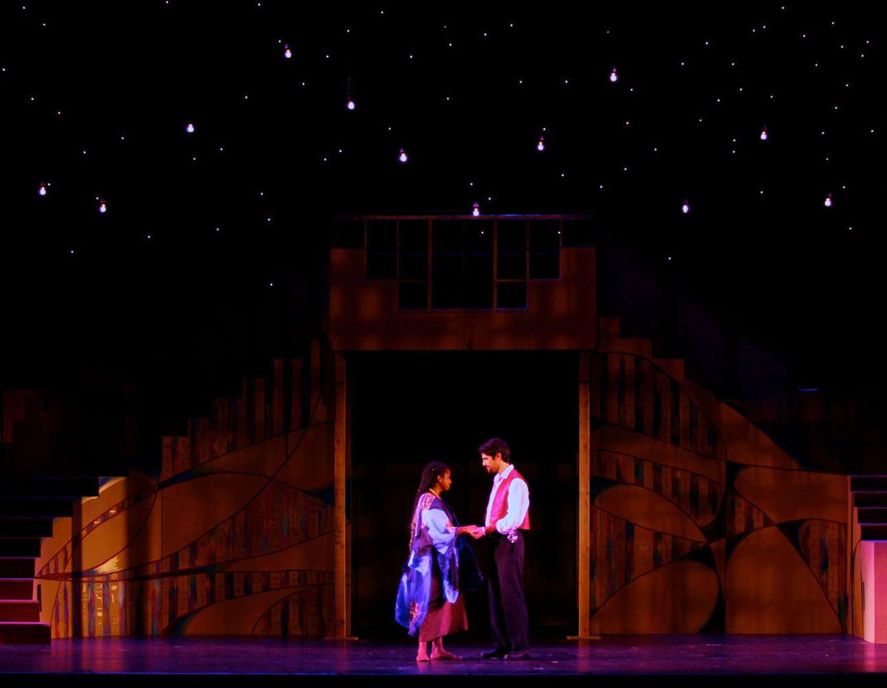
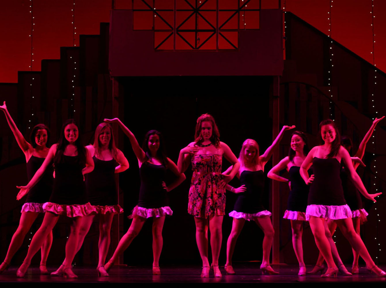
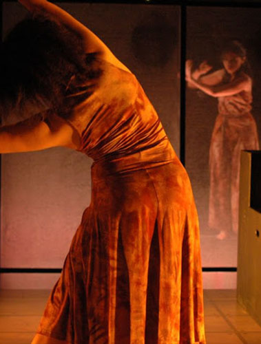
The Last Five Years
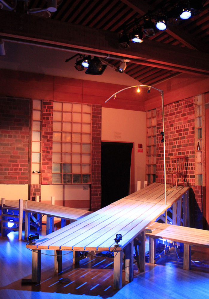
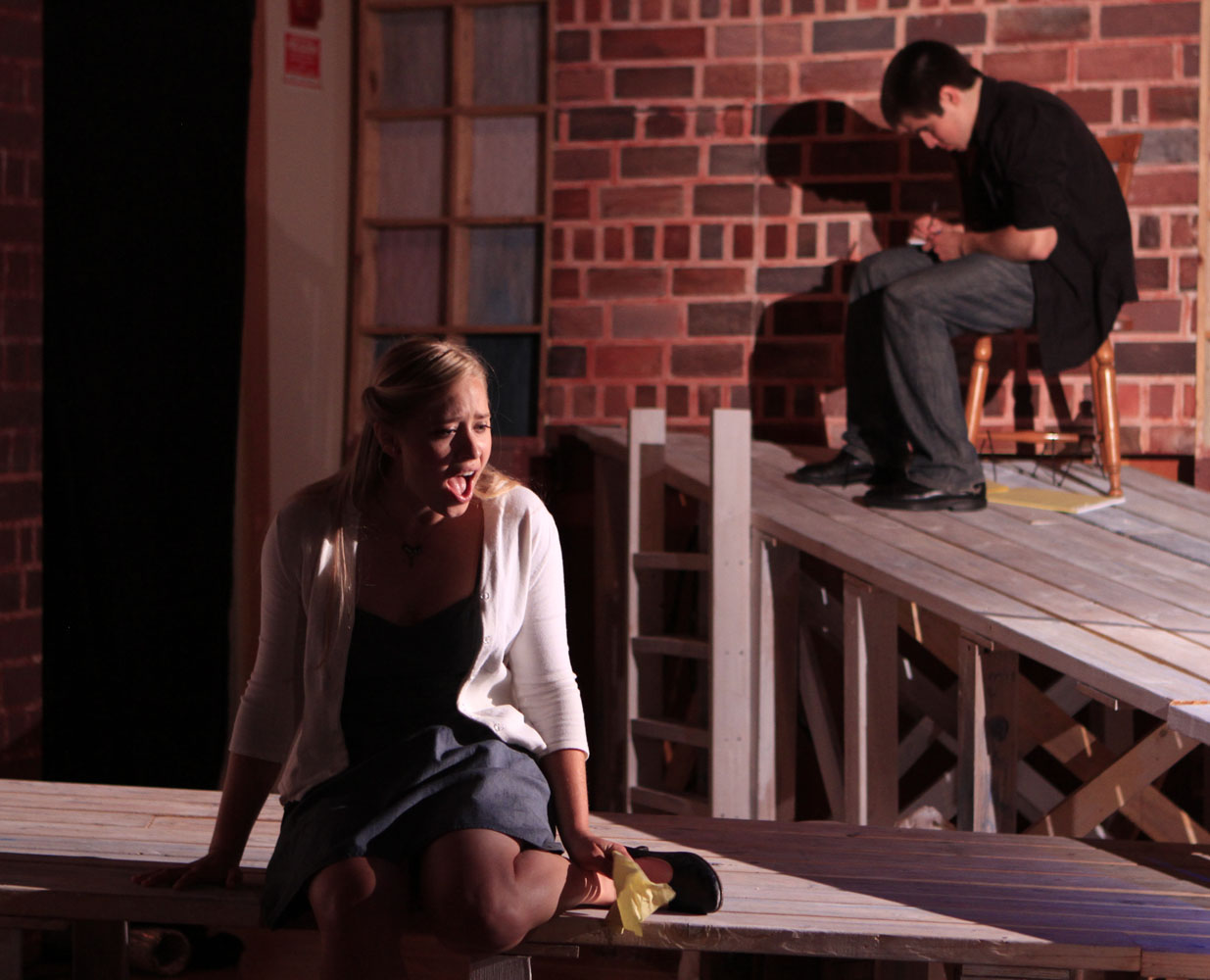
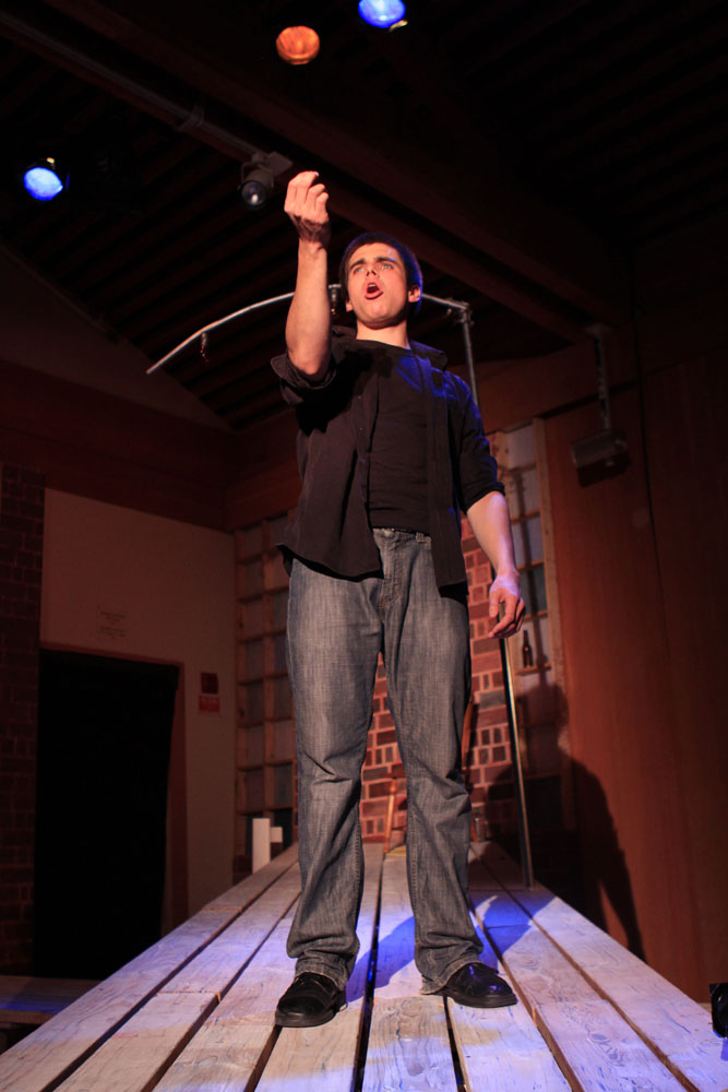
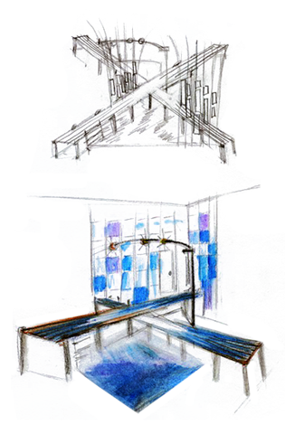
The set design is inspired by key settings of the musical's literary pivot points— the watery-scapes of both Ohio and New York. Cathy and Jamie chart out (moving opposite directions in their star-crossed timelines) how their romance began and ended. The set enables the actors to move forwards/backwards in time and space along separate, raked, and overlapping piers; they only meet once in the middle of the timelines and in space, under the street lamp overarching the docks.
Details
Scenic Designer/Charge: Victoria Flores
Director: Annalise Lockhart
Producer/Music Director: Randi Rudolph
Location: Elliot Programming Center
Ram's Head Theatrical Society
Stanford University 2012
Early Sketches of Pier Concept
‘ Where are the gods, the gods hate us,
the gods have run away, the gods have hidden in holes,
the gods are dead of the plague, they rot and stink too,
there never were any gods, there’s only death.’
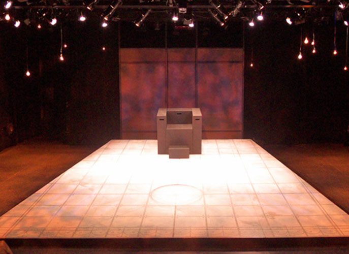
Seneca's Oedipus
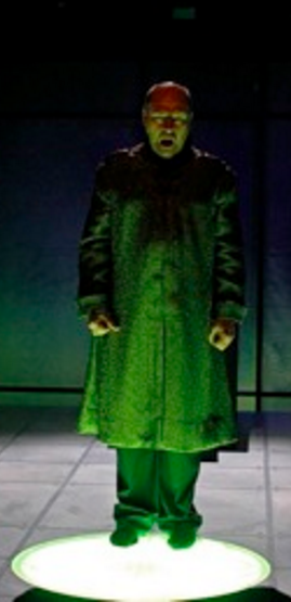
Designed remotely, the director requested a re-imagined setting of the traditional Oedipus to speak to the concepts of 'timelessness', heat, scuttling through sand, and infection. The set draws inspiration from Vrah Vishnulok’s architectural schematic of celestial mapping. An oculus of frosted glass (with embedded leds) sits in the center of the raked trapezoidal deck (a window to the sky), while overhead bulbs map starlight reflections onto the custom flooring. This Oedipus's world is turned essentially upside-down.
Details
Scenic Designer/Charge: Victoria Flores
Director: Matthew Moore
Lighting Designer: Michael Ramsaur
Location: The Nitery
Stanford Summer Theater
Stanford University 2011
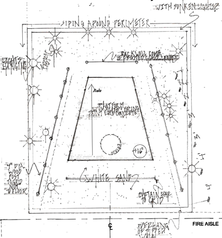
Early Sand Box Concept Draft
“ Sometimes people leave you halfway through the woods,
you decide what’s right, you decide what’s good.”
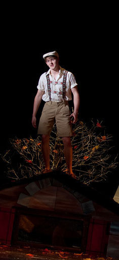
Into the Woods
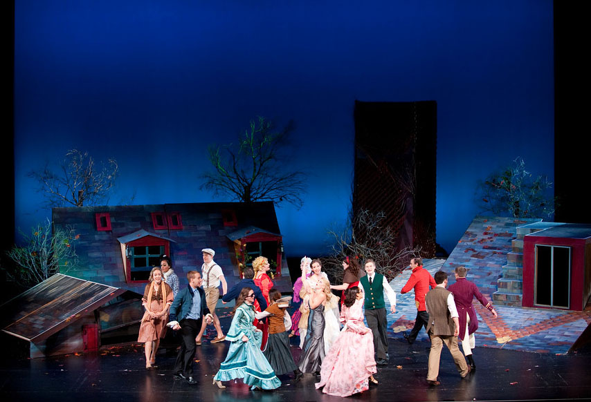
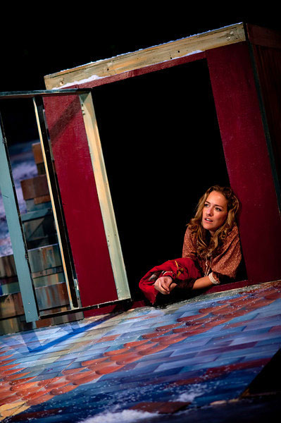
The rooftop set defines a new landscape that frees audience members from any preconceived notions of how one might behave in the woods; this serves to emphasize the tradition of storytelling and aggrandize the nature of acculturated fairytales. The rooftop styles are pulled from countries of origin of the musicals intermingled tales. Tree canopies were reconstructed from salvaged branches. In this way the set accomplishes transitions through the metaphor of 'relationships as seasons' atop the underpinnings of everyday life.
Details
Scenic Designer/Charge: Victoria Flores
Director: Liz Stark
Location: Stanford Memorial Auditorium
Ram's Head Theatrical Society
Stanford University 2010
Early Ground Plan Draft
‘ Have I compromised my people?
In my passion and my haste? I could be his life companion
Anywhere but where we are.’