Product Design

Molekule

fresh air for everyone

Molekule is an eco-conscious start-up developing a set of novel air purifiers complemented by a mobile experience.

Mobile IoT Design systems

context

IN A NUTSHELL

About Molekule

Molekule is a science company with a revolutionary technology that has the power to destroy indoor air pollutants for everyone, anywhere. With four air purifier offerings and a mobile companion, Molekule enables control and connects every one with their air. | Molekule

Role

As a Senior UX / Product designer, part of a small yet mighty supportive design team, I led the design of a key growth mobile feature, resolved a user-centric firmware-dependent conundrum, and co-owned the design system creation in Figma. |  Spring 2021 - Winter 2021

Product

Most notably, I owned the mobile design for à la carte filter purchasing and the incorporation of subscription/account management. In tandem, I optimized the AirPro purifier bootloader for motion, explored scheduler concepts, and shipped a WPA3 connectivity help patch in-app.

Design (Internal)

I co-owned the creation of Molekule's design system in Figma. In addition to porting over what existed in Sketch, we crafted and coalesced three libraries (purifier, foundations and mobile) with embedded flexibility for designers but rigidity to maintain the brand's visual language.

at a glance

À La Carte Filters

Enabling customers to purchase replacement filters for their air purifiers just-in-time through our mobile app.

Role

Product design lead (IC)

Timeframe

~4 months

Scope

D2C North America; Android & iOS

Tools

Figma, Illustrator, Typeform, Notion

Birds-eye

Overview

Problem

A large portion of Molekule’s user base (for a multitude of reasons and motivations) finds it difficult to replace their filters on time to gaurantee their clean air while many others are opting out of an auto-refill subscription within the first six months of purchase.

Business goal

Encourage long-term trust, commitment, and understanding by giving our customers more education on filter life, replacement value, account control, ease of access, and convenience in purchasing for replacing filters on time.

Business objective(s)

Effectively communicate the importance of replacing filters

Build a cohesive experience around filter expiration

Improve customer loyalty and app. visibility through upkeep utility


Impact

An adaptation of this design was implemented and increased filter sales/replacement by ~20%—ultimately providing mobile users with increased flexibility and peace of mind in assuring their fresh air experience.

Behind the scenes

Approach

Design process

At the start of the journey, I sought to thoroughly understand the nature of the problem, establish scope and constraints, audit our web-purchasing experience, validate our users' needs, and compose a design brief.

After completing foundational discovery and aligning with stakeholders, I began with exploratory design to establish a mirrored anatomy that serves our mobile personas. Codifying these components helped shape the design/wireframing of the filter purchase experience. Each development arc underwent critital rounds of iteration, prototyping, review, and testing to become finalized.

Constraints

Must use the same data infrastructure as web e-commerce flow.

Account management must mirror account web-portal content structure.

Filter fulfillment options must maintain a 1-1 relationship of filter to device.

Cross-functional Collaboration

Product & Leadership

Reported to head of UX and collaborated on tie-in project inititatives with team for subscriptions and notifications. Presented design work weekly to ensure stakeholder satisfaction in meeting design and business goals.

Brand

United with copy-team to marry content with design to ensure the brand spirit and craft new processes for collaboration and review/approval.

Growth

Worked closely with growth to ensure strategic alignment of filter sales strategies, limits, and personas.

Marketing & QA

Launched first email UX survey to recent customers and conducted one survey on loyal field-testing users for Air.
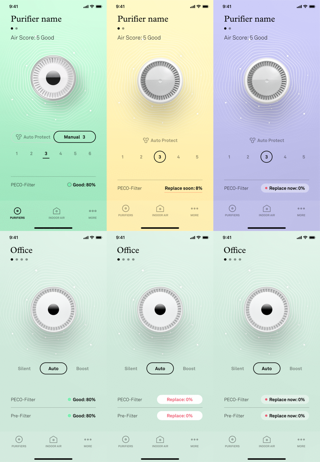
control screen result

Our home control screen ramps up encouraging tapping on filter state by filter health.

entry point - iteration

What's in a dot?

About

It turns out—a lot! Activating the existing tappable 'filter status' moment on our control screen is a testament to permutation complexity. As the chosen primary entry point for filter purchasing, we took every care to maintain the design ethos of our key purifier control screen.

Outcome

Utilizing a single colored dot and bolding by state severity, we introduced a new visual distinction so that ~70% of our users can now recognize this space as tappable to access more on filter status.

Specs

4 Design reviews

20 Iterations / Critiques

rapid

entry point - refinement

Optimizing the accessible

About

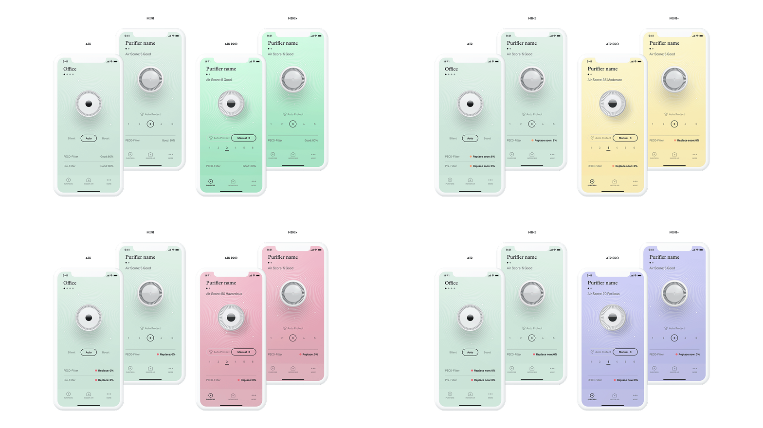
In optimizing the key control screen, we sought to ensure 'filter status' could become a more obvious CTA when any purifier's filter health flipped from 'good' to 'replace soon'.

Key consideration

Our goal was to minimally impact the look and feel of the control screen's calm and focus. With 20 different ways the screen could look given the air quality sensing background shift and filter health state, we opted to maintain the original 'good' state for all devices (minimizing urgency) and introduced colored filter dots as pique decor while bolding the typeface.

filter status result

Mobile users can easily see their filter's state directily linked to replacement opportunity.

filter status - iteration

Houston we have... a block

About

The filter purchase block within 'filter status' was the most contentious in the entire feature design. Every aspect of content and layout was dissected, iterated, and tested to ensure business goals and user success were treated equally with care and intent.

Outcome

We ultimately arrived at treating subscribing and single replacement equally (visually and semantically). With trust as a key determining factor in design success, this ensured a frictionless and judgment-free moment in conversion to encourage users to keep their purifier performing.

Specs

10 Rounds of iteration and review

A revamped filter status focus brings purchasing filters into the limelight.

filter status - detail

When form follows function

About

Moving the opportunity moment of single filter purchasing above the fold required intricate collaboration and balance among design, product, and growth.

Key consideration(s)

Building on insights from new research on why users find it difficult/unnecessary to replace filters. The new block makes the filter replacement top-line visible while ambiently referring to filter health for its background hue. In addition, we were able to factor in design changes from existing pain points, such as the purifiers' name, install guidance, and reframing 'auto-refill' (a contentious term for non-subscribers).

filter status - content

When details make the design

About

With the block design relying heavily on copy, to better understand user pain points in filter replacement, we surveyed new and long-term users. From ~10 distinct personas we discerned education and opportunity were our primary barriers to entry.

Key consideration(s)

Using our research findings as early indicators of attitude, we focused on three semantic directions. Using clarity to show what we offer and why, and conversational light-heartedness to empathize across motivations.

Specs

1 Qual/Quant user survey

10 Participatory design studies

cart result

Mobile users can purchase single filters for each type of purifier.

cart - early wireframe iterations

When not to skew the SKUs

About

Throughout wireframing, we found the filter block entry to be a key piece in defining the cart. We explored opportunities such as converting to subscriptions or making it 'smart' and aware of other purifier filters.

Outcome

Ultimately, we aligned on moving the subscription option to the filter block (before cart entry). In this way, we ensured matching our existing SKUs while easing the process of getting a single filter without friction (even if it costs more), we wanted to support user intention once they've decided to purchase à la carte and not distract from completing the purchase to maintain their air.

Exploring offering directions of our cart vis-a-vis the 'filter status' entry.

purchase happy path

Purchasing a single filter for the first time with an imported account made transparant.
purchasing - flows

How many c(licks) does it take?

About

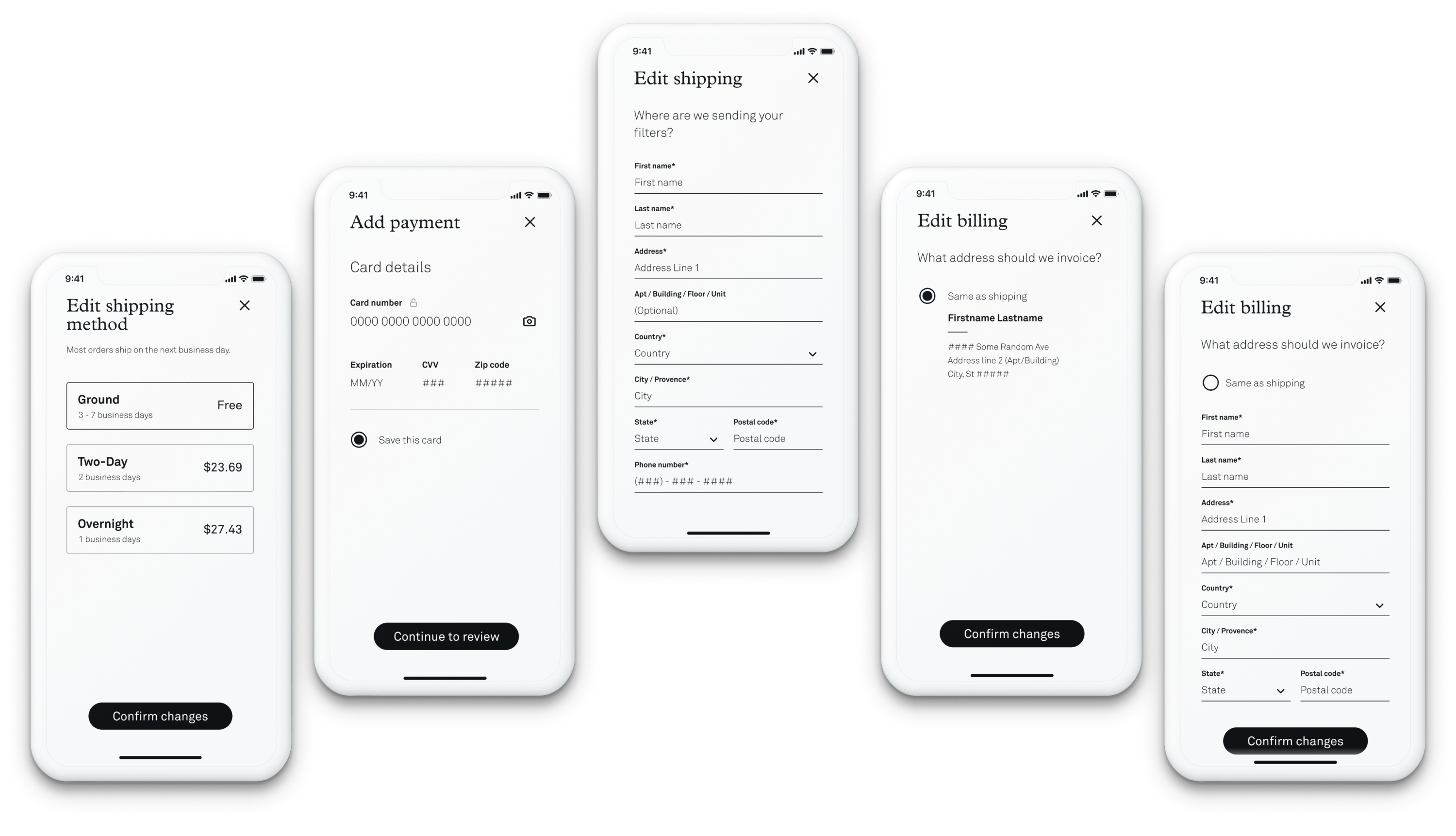
After identifying our primary path, I iterated on the end-to-end purchase journey for the 'reactive' state-minded non-subscriber (when a filter imminently needs replacement). In addition to introducing applePay we created three flows tied to account detail.

Key consideration(s)

Optimizing for the least amount of taps in completing an à la carte filter purchase guided our focus. We prioritized building ease, convenience, and trust (a key concern for unsubscribers) to shorten the purchasing path and ask for permission in saving credentials.

Specs

9 Rounds of iteration and review

purchase editing

Users can easily edit any part of their account or presets during purchase.

More - account management

Ramping up control & transparency

About

Though initial scope prioritized non-subscribers, research showed our web-portal account management to be a major detractor in converting to subscriptions. To support optimized purchase flows, we re-architected our 'More' tab information hierarchy to incorporate subscription and account detailing. We additionally introduced the notion of 'pausing' a subscription, rescheduling fulfillment, and a secondary path to single filter purchase with a general shop.

Key consideration(s)

Parity and semantics guided much of the renewed design for the 'More' tab. Ensuring clarity and parity with existing design patterns formed the final design.

Looking Back

Remarks

Developing the final tripartition experience of filter purchasing for the non-subscriber was an incredibly fascinating journey. While the flows were immediately successful, the content and user motivations that shaped the key moments of the design revealed just how paramount the tiniest of decisions can be in guaranteeing a delightful success.

This growth project unlocked and sparked an incredible opportunity for the product team to collaborate across the organization. We partnered with field-testing to set up our first user study and cohort for future design research. With growth, we collaborated on the entire user journey from web to unboxing to refine a unified experience, improve inclusivity (copy clarity and notifications), and eliminate dark patterns (confirm shaming!).